
5 Common Mistakes That Fail the 5-Second Trust Test
5 Common Mistakes That Fail the 5-Second Trust Test Here’s an uncomfortable truth: your visitor has already decided whether to trust you. Not after reading your…
Your visitor decided before they read a single word.
You spent weeks on your website. The copy is polished. The brand colors are exact. The team page has real photos and everything. And in 50 milliseconds less time than it takes to blink a stranger landed on it, felt something off, and left.
They didn’t know why. They didn’t need to. Trust online isn’t a decision. It’s a reflex.
According to research cited across Stanford Web Credibility studies, 75% of consumers judge a company’s credibility based on its website design. Not your product. Not your reviews. Your design. That judgment happens before they’ve processed what you actually do.
Here’s how to make sure those five seconds work for you.
Passing the five-second test demands an intentional alignment of visual hierarchy and structural clarity. Your layout must immediately anchor the visitor’s eyes, using strategic whitespace, intuitive navigation, and high-contrast typography to reduce cognitive fatigue. When a homepage removes unnecessary friction and honors human scanning patterns, it creates an instant sense of security. This deliberate layout logic transforms abstract brand authority into a felt experience, ensuring your site commands credibility before a single line of copy is read.
Most homepages are built to impress. Big hero image. Brand tagline. Awards section. A headline that sounds like a manifesto.
The problem: none of that is what a first-time visitor is actually asking. What they’re asking immediately, subconsciously is three things: Is this for me? Do I trust this? What do I do next?
If your homepage can’t answer all three in the first scroll, it’s failing the test regardless of how beautiful it is. Clarity converts before design does. A visitor who can’t immediately understand what you offer and who you serve won’t stay to appreciate your gradient or your font choice. The fix isn’t a rebrand. It’s a reorder. Your above-the-fold content everything visible before a single scroll needs to lead with who you help and what you do, not with how you’d describe yourself at a pitch competition.
Google’s research shows that 53% of mobile visitors leave a page if it takes more than three seconds to load. And the damage compounds: when load time increases from just one second to three seconds, the probability of a bounce increases by 32%.
But here’s what the speed conversation misses: slowness isn’t just a UX problem. It’s a signal. A slow site tells the visitor before a single element renders that you don’t respect their time, or that no one’s actively maintaining this thing. Both interpretations kill trust faster than any amount of mismatched brand colors.
With over 63% of global website traffic now coming from mobile devices, a site that hasn’t been optimized for mobile isn’t just technically behind it’s communicating neglect. And neglect reads as risk to someone who’s never bought from you.
If you’re not sure where your site currently stands, tools like Google’s PageSpeed Insights and GTmetrix give you a real performance baseline in under two minutes. The goal is under three seconds on mobile, with a clean mobile layout that doesn’t require pinching or zooming to read.
Research published in Behaviour & Information Technology found that users form an opinion about a website’s visual appeal within five seconds and that opinion shapes how they evaluate everything that follows. The halo effect is real: a clean, organized layout causes visitors to assume the whole experience is equally professional.
The reverse is also true. Outdated typography, misaligned elements, inconsistent spacing, and clashing colors don’t just look bad they register as warning signs. Subconsciously, the visitor is pattern matching against every legitimate website they’ve ever trusted, and yours is failing the comparison.
The five design signals that carry the most trust weight in the first scroll:
None of these are expensive to fix. But all of them are visible in the first five seconds, and all of them are being evaluated whether you want them to be or not.
This is where conversion rate optimization starts not with the checkout page or the email sequence, but with whether the visitor trusts the environment enough to keep reading.
Most websites have testimonials. Most of them are buried on a dedicated page nobody visits, or sitting at the bottom of the homepage after the visitor has already bounced. Social proof only works as a trust signal when it appears at the moment of doubt and for a first-time visitor, that moment is the first scroll. Logos of recognizable clients, a specific result from a real customer, a number that means something: these belong at the top of the page, not as an afterthought after your team section.
The distinction matters: generic testimonials (“Great service, would recommend!”) do almost nothing for trust. Specific proof does. “Our traffic increased 320% in three months” lands differently than “They were amazing to work with.” The specificity is the signal because anyone can make up a nice quote, but a specific result with a named person behind it carries weight.
Our behavioral tracking work consistently shows that visitors who encounter social proof early in the page journey spend significantly more time exploring the rest of the site. Positioning proof early isn’t just a design choice it’s a conversion strategy.
Here’s a pattern that breaks trust quietly: a website that gives the visitor too many options in the first five seconds.
Three equally weighted buttons. A chat widget popping up. A newsletter signup overlaying the content. A sticky header with six navigation items. Every option added to that first view is a cognitive tax and cognitive tax reads as friction, and friction reads as distrust.
Research consistently shows that a single, clear primary call-to-action outperforms multiple competing options not because visitors can’t handle choices, but because the absence of a clear priority signal suggests the site doesn’t actually know what it wants from them. And if the site doesn’t know what it wants, the visitor can’t know whether they’re in the right place.
One primary CTA. One action you want them to take next. Everything else is secondary.
The button text matters too. “Learn more” is not a CTA. “Book a strategy call” is. Specificity reduces perceived risk, and reduced risk is the direct path from attention to action.
Eye-tracking research from Missouri University of Science and Technology shows that it takes about 2.6 seconds for a user’s eyes to settle on the area of your homepage that most influences their first impression. They’re not reading top to bottom. They’re scanning in a pattern left to right across the top, down the left side, across again if something catches them.
This is why the information hierarchy of your above-the-fold design matters more than the information itself. If your most important trust signal your headline, your proof, your clarity statement isn’t positioned where eyes actually land first, it’s effectively invisible.
What this means practically: your headline needs to be in the top-left anchor position, not centered below a hero image. Your credibility indicator (client logos, a specific result, a recognizable partner) needs to appear before the fold, not after it. Your primary CTA needs to be in natural eye-flow, not buried in the bottom right.
This is the kind of layout logic that drives real UI/UX optimization not aesthetic preference, but structural decisions based on how human attention actually moves.
Here’s the uncomfortable part: the majority of websites that fail the 5-second test don’t have an obvious problem. They’re not broken. They’re not ugly. They’re just slightly off in ways the visitor can’t articulate.
The logo doesn’t quite feel right. The copy sounds formal in a way that creates distance. The hero image doesn’t reflect the actual customer. The color palette is technically consistent but emotionally cold. None of these would show up in a design audit. But all of them are registering with the visitor in the first five seconds as a vague sense of something’s not right here and that feeling is enough to leave.
Brand voice and visual identity aren’t separate from conversion infrastructure they’re the foundation of it. When a site’s tone, design, and value proposition are aligned, visitors don’t just understand what you do they feel like they’ve found the right place. That feeling is what drives the next scroll, the second visit, and the inquiry.
Gartner’s 2025 research on brand trust found that only 60% of consumers trust big brands down from 70% in 2021. The gap isn’t being closed by better products. It’s being closed by brands that have gotten more deliberate about what trust looks and feels like as an experience, not just a claim.
There’s a version of this that’s academic and a version that’s diagnostic. The diagnostic version takes about twenty minutes. Find three people who have never seen your website. Ask each of them to look at your homepage for five seconds no more and then close the tab. Then ask them: What does this company do? Who is it for? What would you do next if you were interested?
If the answers are vague, inconsistent, or uncertain, you have your answer.
The 5-second test isn’t a metaphor. It’s a real evaluation tool used in UX research, and running it informally with real people who represent your target audience gives you more useful data than any analytics dashboard. Because what the dashboard shows you is what people did after they stayed. What the test shows you is why people didn’t.
This is the thing that trips up most founders. The goal isn’t to have the most impressive website. The goal is to have a website that makes the right visitor feel, immediately and without effort, that they’ve found the right place.
That requires clarity over cleverness. Specificity over aspiration. Proof over promise. One clear action over five equal options. Speed that signals respect. Design that signals competence. Copy that signals that you understand exactly who you’re talking to and what they actually need.
[Building that kind of web experience is conversion-focused web design in its truest form not a visual exercise, but a trust architecture exercise.
The five seconds are happening whether your site is ready or not.
Trust online is an instantaneous reflex, not a calculated decision. Your visitors will judge your credibility, scan for relevance, and decide whether to stay or bounce before they read a single word of your copy. Passing the 5 second test requires moving past superficial aesthetics and deliberately building a clear trust architecture. By prioritizing immediate clarity, lightning-fast mobile speed, strategic social proof, and un distracted visual hierarchy, you transform your homepage from a vanity metric into a high converting environment that instantly commands authority.
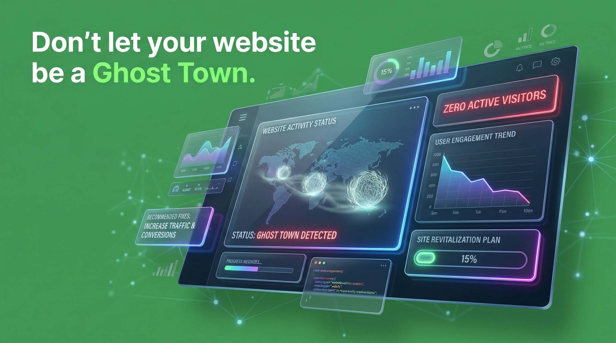
Because in 2026, the difference between a “No” and a “Yes” isn’t your tech stack it’s the human strategy behind it. Let’s turn your digital ghost town into a conversion machine.
5 Common Mistakes That Fail the 5-Second Trust Test Here’s an uncomfortable truth: your visitor has already decided whether to trust you. Not after reading your…
How to Ensure Your Website Passes the 5-Second Trust Test Your visitor decided before they read a single word. You spent weeks on your website. The…
How to Build a Successful AI Brand for the Future Everyone’s building AI. Almost nobody’s building a brand. It’s 2026. The AI market has more products,…