
How to Avoid Regret Buying the Xbox Nano Controller
How to Avoid Regret Buying the Xbox Nano Controller The Xbox Nano Controller is $49.99, pocket-sized, and open for pre-order. The headlines make it sound like…
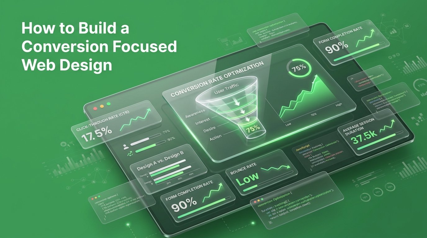
You spent good money building a gorgeous website, and the traffic is finally rolling in so why aren’t those visitors turning into paying customers? The truth is, a beautiful site isn’t always built to sell, but mastering conversion-focused web design can bridge that gap and turn your hard-earned traffic into steady revenue. When every click costs time and money, optimizing your site’s ability to sell isn’t just nice to have; it’s vital for your bottom line.
In this guide, we’ll dive into actionable strategies to transform your site from a simple online business card into a high-converting sales engine. You’ll learn how to optimize your above-the-fold design, fix conversion bottlenecks, reduce cart abandonment, and use behavioral tracking to make data-driven improvements.
Stop letting valuable traffic go to waste on a site designed only for appearances. Every day your web layout confuses or slows down visitors is another day of lost sales and squandered advertising spend. Transitioning from a pretty site to a sales engine takes a systematic, data focused approach. Let our team audit your sales funnel, eliminate hidden user friction, and convert your existing traffic into predictable, continuous business growth.
Most websites get built backwards. Someone picks a template or hires a designer, the team argues about fonts and colors for three weeks, and the site launches when it “feels done.” Nobody asks what the visitor is supposed to do on any given page.
That’s the gap. A beautiful site and a converting site are not the same project, even though they usually get built by the same team, at the same time, with the same budget.
We see this constantly through our conversion rate optimization work: sites with award-worthy design pulling in a fraction of the leads a plainer, sharper-structured competitor gets from the same traffic volume.
A pretty site earns compliments. A conversion-focused site earns customers. Only one of those pays your bills.
Here’s the part most agencies skip: people don’t read your website. They scan it.
Nielsen Norman Group’s original eyetracking research tracked how visitors actually look at a page, and the pattern holds up nearly two decades later people read the top of a page, skim a bit further down, then scan the left edge for anything that catches their eye. They are not reading your carefully written paragraph three. They’re hunting for a reason to keep going or a reason to leave.
That changes everything about how a page should be built. If your value proposition is buried under a hero video, a scrolling carousel, and two paragraphs of “who we are,” you’ve lost most visitors before they ever reach your actual offer.
And speed makes the problem worse before design even gets a chance. In Google’s own mobile benchmark research, more than half of mobile visitors abandoned a page that took longer than three seconds to load. Your headline could be perfect. If the page hasn’t rendered yet, nobody sees it.
Conversion isn’t a copywriting problem or a design problem. It’s a behavior problem and most sites are built without anyone studying the behavior at all.
This is the framework we run on every site rebuild, in order. Skip a step and the rest gets shakier.
Know exactly where visitors are supposed to go homepage to product, product to cart, cart to checkout before a single wireframe exists. We start every project with a sales funnel breakdown so we know which step is actually leaking, instead of guessing.
Your visitor should know what you sell, who it’s for, and what to do next without scrolling. Not a mission statement. Not a slogan. The offer.
A slower site can lose visitors before they ever see your best design work. Compress images, cut unnecessary scripts, and test on an actual mid-range phone not your office Wi-Fi.
Every extra link, banner, and nav item is a chance for someone to leave without converting. Pick the one thing you want done on that page and remove what competes with it.
This is where good traffic quietly disappears. Baymard Institute’s checkout research puts the average cart abandonment rate at over 70%, and their testing shows fixing checkout usability issues alone can lift conversion by more than 35%. Every field you cut is friction you remove.
Session recordings and scroll maps tell you where people hesitate, rage-click, or bail data your analytics dashboard can’t show you on its own. This is exactly what our behavioral tracking work is built to catch.
A first-time visitor and someone on their third visit shouldn’t see the identical page. Simple personalization different messaging for returning visitors, cart reminders, dynamic offers recovers revenue a static site leaves on the table.
None of this requires a full redesign. Most of it is faster, cheaper, and more effective than starting over.
Before we change a headline or move a button, we run a full audit: funnel mapping, behavioral session review, speed testing, and a friction-point breakdown ranked by revenue impact. We also plug in predictive analytics so we’re not just reacting to last month’s drop-off we’re catching it before it costs you the quarter.
It usually takes 48 hours. It usually finds three to five fixable leaks nobody on the internal team had flagged, because they’re too close to the site to see it the way a first-time visitor does.
If your traffic looks fine but your revenue doesn’t, the fix is rarely more traffic. It’s a site built to convert the traffic you already have.
Stop guessing where your visitors are dropping off. Book a free audit call at THEMAYK and we’ll show you exactly where your site is losing the sale.
Traffic isn’t your problem; conversion is. A visually stunning website means nothing if it doesn’t turn casual visitors into paying customers. By focusing on user behavior, eliminating unnecessary friction, and placing your offer front and center, you can stop leaking revenue. Ready to transform your site into a high-converting sales engine? Book your free audit call with THEMAYK today and let’s unlock your website’s true revenue potential.
Because in 2026, the difference between a “No” and a “Yes” isn’t your tech stack it’s the human strategy behind it. Let’s turn your digital ghost town into a conversion machine.
How to Avoid Regret Buying the Xbox Nano Controller The Xbox Nano Controller is $49.99, pocket-sized, and open for pre-order. The headlines make it sound like…
Is the Xbox Nano Controller Actually Comfortable? You’ve read the headlines: five inches, 3.5 ounces, $49.99, all 18 inputs. Everyone’s calling it cute. Nobody’s answered the…
How to Master Social Media Marketing Fast You are posting three times a week on Instagram and LinkedIn. Your designer makes pristine templates, and your team…
How we use your info: Used strictly to review your project, prepare tailored insights, and reach out for a 1-on-1 strategy call. Zero spam, zero shared data.