
The Ultimate Guide to Brand Positioning Strategies
The Ultimate Guide to Brand Positioning Strategies You hired the agency. You ran the ads. You published the content. And your pipeline still moves like it’s…
You’ve stared at your logo for the hundredth time this month, wondering if a refresh would finally make people “get it.” It won’t. Most businesses think a tired brand means a tired logo. So they redesign it. New colors, new typeface, maybe a sleeker icon. Six months later, nothing’s changed. Same confused customers. Same “what do you guys actually do?” conversations. Same competitors winning deals with a worse product and a clearer message.
Here’s the part nobody tells you: your logo was never the problem. Your positioning was.
And positioning isn’t something you can redesign your way out of.
Trying to appeal to everyone is a financial trap disguised as a growth strategy. When you refuse to narrow your focus, your messaging dilutes into white noise that fails to convert. True positioning requires the courage to exclude. By explicitly defining who your product is not for, you instantly become irreplaceable to the exact audience you need to win. Specificity isn’t limitation it is your ultimate competitive advantage.
When growth stalls, the instinct is to touch what’s visible. The logo, the colors, the website template. It feels like progress. You shipped something. You can show it to your team.
But a McKinsey analysis on branding found that a brand consists of more than a bundle of tangible, functional attributes its intangible, emotional benefits and identity frequently serve as the basis for long-term competitive differentiation and sustained loyalty. McKinsey & Company
In other words: the logo is the outfit. Positioning is the personality underneath it. You can put a sharper outfit on a brand that has nothing to say, and it’ll still have nothing to say. Just in a nicer font.
A new logo on a vague brand is just a vague brand with better lighting.
Picture a customer landing on your homepage for the first time. They scroll for ten seconds.
Can they answer this: “Who is this specifically for, and why should I pick them over the other twelve tabs I have open?”
If the honest answer is “not really” that’s not a design problem. That’s a positioning gap. Your logo can be flawless and that gap still exists. Because positioning lives in the words, the offer, the specificity not the visual layer. The distinction matters more than most agencies admit. As one industry breakdown puts it, brand identity is the overall perception of a brand by its consumers, created through a combination of factors including mission, values, personality, and visual identity while visual identity is just the visual representation of that brand. Tacpoint Visual identity is one ingredient. Positioning is the recipe.
You can’t taste a recipe by looking at the plate it’s served on.
Here’s where it gets interesting.
We’ve sat in calls where founders show us beautiful brand books locked-in colors, perfect typography, a logo that’s been through six rounds of revisions. And the brand still doesn’t convert.
Why? Because positioning isn’t about how something looks. It’s about the claim you’re making and the specificity of who it’s for.
Most brands write positioning statements that could belong to any company in their category. “We help businesses grow.” “We deliver quality and innovation.” “Your trusted partner for results.” Swap the logo on that statement, and nobody would notice.
Research on differentiation backs this up directly a 2022 Harvard Business Review study found that well-differentiated brands retained up to 75% of their customers, compared to an industry average of 48%. Emulent
That’s not a visual outcome. That’s a clarity outcome.
The brands winning right now aren’t louder. They’re more specific.
Positioning isn’t a slogan. It’s not your tagline, and it’s definitely not your color palette. Positioning is the answer to three questions, stated so clearly that a stranger could repeat it back to you:
Most businesses can answer maybe one of these clearly. The other two are vague enough to apply to ten competitors.
McKinsey’s branding research is blunt about what happens when you get this right: companies with strong brands have earned up to 5 percentage points higher total return to shareholders than their industry counterparts. McKinsey & Company
That’s the financial weight of a clear answer to three questions. Not a redesign.
If your positioning needs a slide deck to explain, it’s not positioning. It’s a pitch.
This is the mistake we see most and it’s almost always well-intentioned. A business wants to seem capable, so it lists every service it offers. Every audience it could serve. Every problem it could theoretically solve. The thinking is: more options, more potential customers. The reality is the opposite. When you position yourself for everyone, you become memorable to no one.
A study on brand differentiation found that consumers are 4 to 6 times more likely to trust, champion, and defend companies with a strong brand purpose, and purpose-driven brands grow roughly twice as fast as those without one. Shno
Purpose requires a stance. A stance requires saying no to some people, so you can say something real to the right ones.
Trying to be relevant to everyone is how you become invisible to anyone.
Here’s where most “brand strategy” gets overcomplicated. You don’t need a 40-page brand book to fix positioning. You need one sentence that’s specific enough to be true and narrow enough to be useful.
Not: “We help companies improve their marketing.”
Try: “We help direct-to-consumer skincare brands under $2M in revenue stop losing money on ads that look great but don’t convert.”
Read those two out loud. One could be on any agency’s homepage. The other could only be on yours, because it names a real audience, a real symptom, and implies a real cause. That’s the entire shift. From describing what you do, to naming who you do it for and what’s actually broken in their world right now.
Specific isn’t smaller. Specific is just harder to ignore.
This is the part you can start today. No designer required.
Most of this work happens in a notebook, not in Figma.
When a brand comes to us saying their visuals feel “off,” the first thing we do isn’t open a design file.
We start with brand strategy pulling apart the actual positioning statement, the audience definition, and the claim being made, before anyone touches a color swatch.
Most of the time, the visual identity is fine. What’s missing is a sentence that tells people exactly who the brand is for and why it’s different the kind of content strategy and conversion-focused website experience work that makes everything downstream your homepage, your ads, your sales calls finally pull in the same direction.
Once that’s locked, then we look at whether the visuals match. Sometimes they need a refresh. Often, they just need to be pointed at a clearer message. If your brand feels off and you’ve been staring at your logo trying to figure out why, let’s find out what’s actually going on. Book a free audit call at www.themayk.com.
Stop guessing. Start growing.
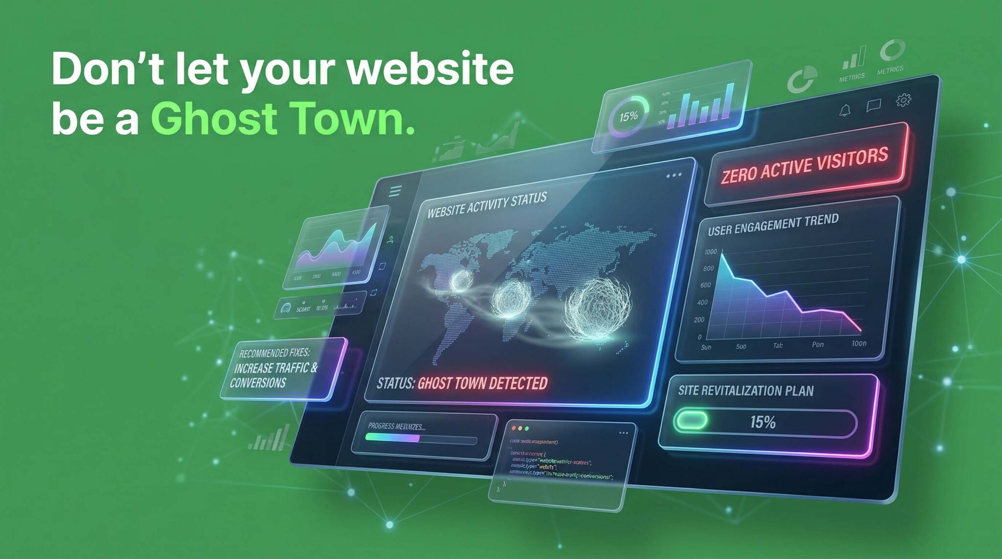
Because in 2026, the difference between a “No” and a “Yes” isn’t your tech stack—it’s the human strategy behind it. Let’s turn your digital ghost town into a conversion machine.
The Ultimate Guide to Brand Positioning Strategies You hired the agency. You ran the ads. You published the content. And your pipeline still moves like it’s…
How to Improve Your Brand Positioning Without Changing Your Logo You’ve stared at your logo for the hundredth time this month, wondering if a refresh would…
Where Do Premium Brands Find Success with Motion Before Ads? You’ve spent months getting the product right. The packaging is dialed in, the pricing makes sense,…