Where to Find the Best Techniques to Improve SaaS Conversions?
Where to Find the Best Techniques to Improve SaaS Conversions? Struggling to turn visitors into paying customers despite heavy ad spend? When your free-to-paid trial conversion…
Most startups look like startups. Not because they lack talent or ambition because they’re spending money on the wrong things in the wrong order. This is how you fix that without waiting for a Series A to afford good branding.
Here’s what nobody tells a first-time founder: your branding is being judged before your product is. Before a potential customer reads your landing page copy, before they click a button, before they see your pricing they’ve already formed an opinion. And that opinion is almost entirely visual.
Research published by CXL Institute found it takes just 50 milliseconds half the time it takes to blink for a visitor to form an opinion about your website. Not a considered opinion. A felt one. A gut reaction that sets the entire frame for everything they experience afterward.
That’s the problem most startups are handing investors, customers, and partners before they’ve said a single word. And it’s completely fixable if you understand what premium actually means and how AI has collapsed the cost of achieving it.
We’ve built brand systems for DTC founders, early-stage operators, and Series A companies at TheMayk. The ones that looked 10x their budget didn’t have bigger teams or better luck. They had a smarter system. This is that system.
The difference between a startup that looks like a side project and one that feels like a category leader isn’t bigger budgets or better designers it’s ruthless prioritization. Strategy always comes before tools. Voice before visuals. Systems before content. When you get this order right, AI stops being a shortcut and becomes a genuine multiplier. You can now create visual polish, consistent voice, and obsessive brand signals that previously cost tens of thousands of dollars. The tools are democratized, but the thinking and discipline still separate the winners.
When a startup’s brand looks cheap, the instinct is to blame the logo. So they get a new logo. And it still looks cheap. Because the logo wasn’t the issue.
What makes a brand look premium or not is the sum of dozens of micro-signals happening simultaneously. The weight of the typography. The breathing room between elements. The coherence between what you say and how it looks. The consistency between your Instagram, your landing page, and your email footer. Individually, each of these signals is almost imperceptible. Together, they create a feeling that either says “this is a real company” or “this is someone’s side project.” Customers can’t explain why they feel it. But they feel it instantly. And they act on it or don’t.
32%
The same pattern holds at every stage. A startup that looks premium attracts better talent, converts at higher rates, closes partnerships faster, and commands pricing its competitors can’t hold. None of that comes from a logo. It comes from a brand system and AI has made building one accessible to companies at every budget level.
Premium branding isn’t expensive branding. It’s intentional branding. There’s a meaningful difference.
Expensive branding means you paid a lot. Intentional branding means every visual and verbal choice reinforces the same feeling. When those choices are coherent, the brand reads as premium regardless of the tool used to create it. When they’re inconsistent even if each piece is well-made the brand reads as confused.
Typography Cheap brands use default system fonts with random mixed weights, making everything feel generic and unpolished. Premium brands stick to one distinctive typeface applied with strict discipline across all touchpoints. This creates instant recognition and a refined personality that feels intentional.
Color Cheap brands throw 5 or more colors together randomly, creating visual noise and confusion. Premium brands limit themselves to 2-3 colors and apply them with clear, consistent rules. The restraint signals confidence and makes the brand feel more luxurious and memorable.
Spacing Cheap brands cram elements together with tight, crowded layouts that give no breathing room. Premium brands use generous white space deliberately. This breathing room creates elegance, focus, and a sense of quiet confidence that instantly elevates perception.
Voice Cheap brands sound different on every channel professional on email, casual on Instagram, corporate on the website. Premium brands maintain the exact same personality everywhere. This consistency makes the brand feel authentic, trustworthy, and instantly recognizable.
Visuals Cheap brands rely on generic stock photos that their competitors are also using. Premium brands build a distinct visual direction that belongs only to them. This uniqueness stops the scroll and creates the emotional pull that turns customers into fans.
None of the “looks premium” column requires a massive budget. Every single one requires a decision and then the discipline to hold it. AI has made executing those decisions faster, cheaper, and more consistent than any previous point in history.
According to the Lucidpress State of Brand Consistency Report, consistent branding alone can increase revenue by up to 33%. The brands not seeing that lift aren’t doing something complex wrong. They’re doing something simple wrong: their brand doesn’t look the same across every touchpoint.
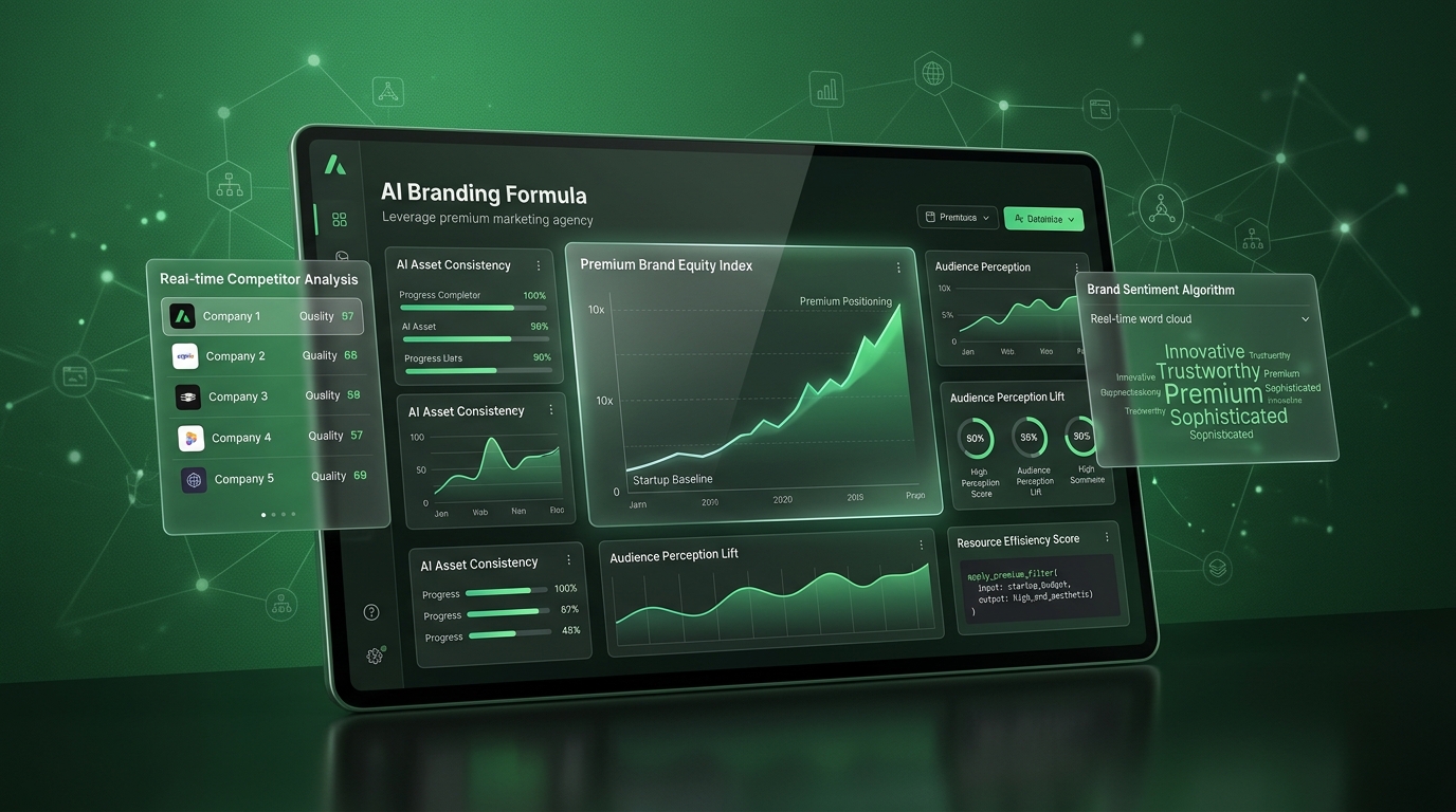
The single biggest mistake startups make with AI branding tools is starting with the wrong step. They open Canva or Midjourney or a logo generator before they’ve answered the foundational questions and then they’re surprised when the output looks generic, because it is. The tool can’t fill in what the strategy never answered. The formula we use has five steps. The first two are entirely strategy. No tool can do them for you. Steps three through five are where AI does the heavy lifting but only because steps one and two gave it something real to work with.v
This is not a mood board exercise. This is a business decision. When your ideal customer encounters your brand for the first time, what should they feel? Not think. Feel. Confidence? Exclusivity? Belonging? Disruption? The feeling is the brief that every visual and verbal choice then serves. Most startups skip this and go directly to visual execution. The result is a brand that looks assembled rather than designed because it was. Each piece might be fine in isolation, but without a shared emotional target, the pieces don’t add up to anything.
Write this down in a single sentence. Not a paragraph a sentence. “When a [target customer] sees our brand, they should feel [specific feeling], because that’s what they’re missing from every other option in this category.” That sentence is your north star. Everything else in the formula is tested against it.

Voice comes before visuals. This runs counter to what most founders do they build the logo, design the website, then figure out “how we sound” as an afterthought. The problem is that voice shapes every visual choice: the typography that feels right for a confident, direct brand is different from the one that fits a warm, approachable brand.
Define three things: what your brand would say, what it would never say, and what it sounds like when it’s at its sharpest. Pull language directly from your best customers’ reviews and conversations that’s the vocabulary your audience already trusts and responds to. Feed this into our AI-powered content system as the training layer, not a prompt.
Once voice is locked, every piece of copy from your homepage headline to your email subject lines has a standard to hit. That consistency is what makes the brand feel coherent. And coherence, as we just established, is what drives the 33%.
This is where AI earns its place in the formula. Once the emotional target and voice are set, use Midjourney to pressure-test visual directions fast before committing to anything expensive. In the time it used to take to brief a designer and wait for three concepts, you can now explore forty directions and immediately see what resonates. The goal at this stage isn’t to generate final assets. It’s to find the visual territory that belongs to your brand and your brand only. The color palette range. The compositional energy dense or airy, warm or cold, editorial or raw. The mood that matches what you decided your customer should feel in Step 01.
Once the direction is validated, everything downstream your 3D product renders, your ad creatives, your website aesthetic is built on a foundation instead of gut instinct. That’s the difference between a brand that coheres and one that just has a lot of well-made pieces.
A brand kit is a logo in three sizes and a hex code document. A brand system is the set of rules that governs how every visual element behaves in every context and the templates that make those rules impossible to break by accident.
Build the system with AI, not the assets. Use tools like Adobe Firefly and Canva’s AI features to create templates that lock your typeface choices, your spacing rules, and your color hierarchy into every content format you’ll use. This means your social posts, your pitch deck, your email campaigns, and your website all read as versions of the same brand not as content made by three different people on three different days.
This is what makes a startup look like it has a much larger team than it does. Systematized execution. Not more people better rules. Our content strategy engagements at TheMayk always start here, because a brand that can’t scale its own execution can’t grow without looking increasingly inconsistent.
Brand systems reduce off-brand content by up to 81%, per Lucidpress
This is where the majority of startups leave the most money on the table. They have a solid brand system, a clear voice, good copy and then they use mediocre product visuals that undercut everything else. The customer’s brain doesn’t separate these components. The brand is experienced as a whole. And one weak layer drags the whole thing down.
3D product visualization has historically been inaccessible to early-stage companies because the production cost was prohibitive. That’s no longer true. AI-assisted 3D animation and commercial visuals have changed the economics completely. A startup can now have product imagery that looks indistinguishable from what a Fortune 500 brand produces at a fraction of the cost if the visual direction from Step 03 was done right.
One of our clients a three-SKU supplement brand launched with AI-assisted 3D visuals built on a validated visual direction. Their first month revenue hit $110K. The product was good. But the visual identity made customers feel like they were buying into something that had already arrived. That feeling is worth more than any single channel or tactic.
Product visual overhaul contributed to $110K revenue in launch month
You can follow every step in this formula and still end up with a brand that looks mediocre. There’s one reason it happens: you stop applying the rules when it feels inconvenient.
Someone needs a social post in a hurry. They grab a stock photo that’s close enough. Someone writes an email and the tone drifts toward corporate because they were in a corporate headspace. A pitch deck gets assembled with whatever was available, not with whatever matched the system.
Each of these decisions feels small in the moment. Cumulatively, they erase everything the brand system built. Brand consistency isn’t a design project it’s a behavioral discipline. And the brands that hold it are the ones that compound. The premium brands you admire didn’t get there by doing better work once. They got there by doing consistent work every time even when nobody was watching.
This is why the system has to be built to be self-enforcing. Templates that don’t allow off-brand fonts. A voice document that gets shared with every contractor and team member. A visual direction document that gets consulted before any creative decision not after. Our brand analytics work consistently shows that the brands with the highest customer trust scores aren’t the most creative they’re the most consistent.
Startup budgets are finite. The formula above isn’t designed to spend money on everything at once it’s designed to spend it in the right order, so each investment compounds on the one before it.
Don’t spend on paid media until the brand system is in place. Driving traffic to a brand that doesn’t convert is funding a leaky bucket. Every dollar you put into paid social or Google Ads before the brand looks premium is a dollar teaching the algorithm that your brand doesn’t close which makes your next dollar more expensive.
Don’t spend on content volume until the voice is locked. Posting consistently with an inconsistent voice trains your audience to expect nothing specific from you. And an audience that expects nothing won’t react when you finally have something worth saying.
Do spend on visual direction first. The 50-millisecond window is real. Your customer has already made a judgment call before your best copy has a chance to work. Fix the judgment call first. Do spend on a brand system before you scale. The cost of rebuilding inconsistent brand assets at scale is dramatically higher than building a system correctly once. We see this in almost every brand audit we run through our conversion rate optimization work the brands that look expensive are almost always the brands that made the system investment early.
This is the part worth sitting with. The tools in this formula Midjourney, Firefly, Jasper, the 3D render pipeline are accessible to any brand willing to use them. Your competitors have access to the same capabilities.
What they can’t copy is the strategy that precedes the tools. The emotional target from Step 01. The voice document from Step 02. The validated visual direction from Step 03. These are the outputs of thinking that belongs only to your brand and no AI can generate them without the human work that created them.
The startups that will look 10x their budget in 2026 aren’t the ones with the biggest AI subscriptions. They’re the ones who did the strategic work first, fed the tools something real to work with, and then held the system with enough discipline to let consistency do what it does: compound. The visual infrastructure McKinsey tracked the kind that delivers 32% higher revenue growth isn’t built in a weekend. But it’s also not built with a massive agency retainer anymore. It’s built with a smart formula, the right tools, and the will to hold the standard when it’s inconvenient.
That’s what we build at “TheMayk”. Not just brands that look good brand systems that perform.
If your brand isn’t communicating the level of company you actually are, let’s fix it. Book a free 20-minute brand audit call and we’ll show you exactly where the signals are breaking down.
Startups that look 10x more premium don’t spend more they think better. By putting strategy before tools, voice before visuals, and systems before content, you can build a brand that commands trust and attention on a startup budget. AI makes execution affordable, but only disciplined thinking creates obsession. Do the hard work upfront. The premium perception will follow and so will the revenue.
Because in 2026, the difference between a “No” and a “Yes” isn’t your tech stack it’s the human strategy behind it. Let’s turn your digital ghost town into a conversion machine.
Where to Find the Best Techniques to Improve SaaS Conversions? Struggling to turn visitors into paying customers despite heavy ad spend? When your free-to-paid trial conversion…
Why Is It Important to Improve Conversion Rates in SaaS? You’re running a SaaS product with real signups coming in every week. The trial numbers look…
Top 5 Features of the TikTok Ads Library You Need to Know You’ve spent three weeks scripting a TikTok ad from scratch with nothing but a…