Where to Find the Best Techniques to Improve SaaS Conversions?
Where to Find the Best Techniques to Improve SaaS Conversions? Struggling to turn visitors into paying customers despite heavy ad spend? When your free-to-paid trial conversion…
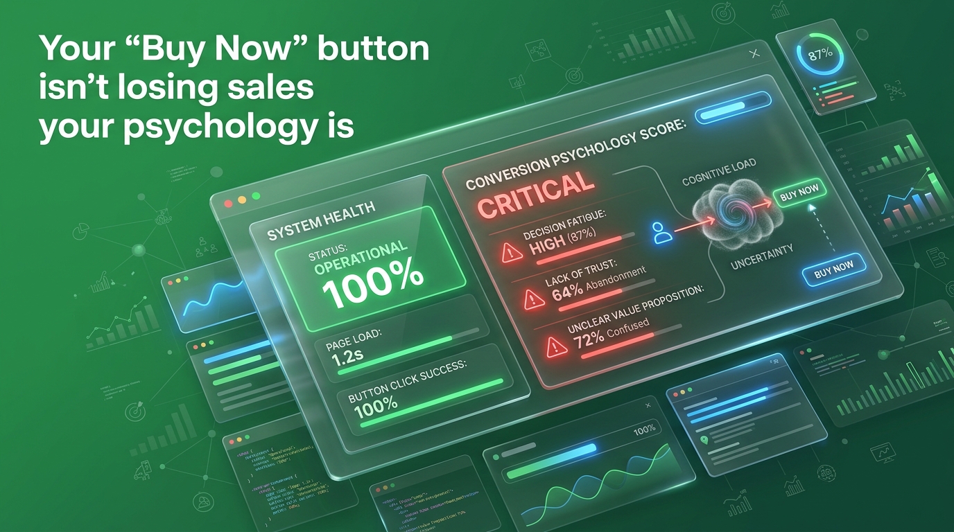
Most e-commerce brands spend months testing button colors, tweaking copy, and A/B testing button placement. Red vs. orange. “Buy Now” vs. “Add to Cart” vs. “Get Yours Today.” They run the tests, move the decimal points, and wonder why the lift is so marginal.
Here’s the problem: they’re treating symptoms. The “Buy Now” button doesn’t convert because it looks right. It converts because the brain already decided to buy and the button just confirms it.
We’ve worked across enough DTC brands and e-commerce funnels to tell you this straight: the businesses getting the highest conversion rates aren’t winning on design. They’re winning on psychology. Specifically, they’ve deliberately or accidentally mapped three cognitive biases into the moments right before the click. This is what’s actually happening inside your customer’s head. And once you understand it, you can’t unsee it.
Most brands fail because they treat the “Buy Now” button as a starting point rather than a final confirmation of a psychological journey. By the time a user reaches your call-to-action, their brain has already calculated the risk of loss, searched for social validation among their peers, and weighed the urgency of your offer against their own hesitation.
Before getting into the three triggers, you need to understand one foundational truth, people don’t make purchase decisions rationally.
Most of us like to believe we evaluate options logically compare features, weigh price, assess value, then decide. That’s not how it works. Research from Daniel Kahneman and Amos Tversky, whose work on Prospect Theory earned a Nobel Prize in Economics, established something that should make every marketer stop and rethink everything: we don’t make decisions based on gains and losses we make them based on the fear of losses versus the hope of gains. And the fear is roughly twice as powerful. That asymmetry isn’t a quirk. It’s a design spec for the human brain. And it runs through every purchase decision your customer makes before, during, and after they see your buy button.
The three triggers below are not manipulation tactics. They’re maps of how human cognition actually works and most brands are either activating them accidentally, ignoring them entirely, or worse, accidentally working against them.
Trust isn’t built through a high-speed API. It’s built through nuance, shared values, and being specifically relevant to someone’s life. If your brand doesn’t feel like it was built by people for people, your bounce rate is going to keep climbing.
At “TheMayk”, we bridge that gap. We don’t just “plug in” tools, we build a strategic layer that uses tech to amplify human creativity, not replace it. We call this The Resonance Framework.
Kahneman and Tversky’s research established that the psychological pain of losing something is roughly 1.5 to 2.5 times more intense than the pleasure of gaining something equivalent. That’s not a rounding error. That’s the architecture of every purchase decision your customer makes.
When a customer lands on your product page and hovers near the buy button, they’re not thinking “I want this.” They’re running a mental calculation: What do I lose if I spend this money and it’s wrong for me? Most brands respond to this by selling harder. More benefits copy. More features. More reasons to buy. That’s the wrong direction. You’re trying to talk someone into a gain when their brain is calculating a loss.
What you should be doing instead is removing the fear of loss.
Free returns. Money-back guarantees. Trial periods. Live inventory counts that confirm they’re not wasting their research time on something that might not ship. Every one of these elements speaks directly to the loss-aversion calculation your customer is running and it speaks louder than any benefit claim you could write.
A 2025 study published on ResearchGate examining psychological triggers in online shopping confirmed that scarcity and urgency both significantly increase purchase intent but critically, their effect compounds when the perceived risk of missing out is greater than the perceived risk of buying wrong. That’s loss aversion at work. The buy button becomes irresistible when the cost of not clicking it feels higher than the cost of clicking it.
This is why our conversion rate optimisation work at “TheMayk” often starts before the button. We audit what’s missing the trust signals, the guarantees, the friction points that the customer reads as “this is risky.” Because until those are addressed, button color is irrelevant.

Humans are wired to look at what other people are doing when they’re uncertain. This isn’t weak-mindedness. It’s efficient risk management. When you don’t have perfect information, the behavior of others becomes the most reliable signal of quality available.
In e-commerce, this plays out in reviews. Not as a nice-to-have feature as a fundamental driver of whether someone converts at all.
Research from Northwestern University’s Spiegel Research Center found that products with at least five reviews are 270% more likely to be purchased than products with no reviews. For higher-priced products, displaying reviews increased conversion rates by 380%. These aren’t marginal lifts. These numbers are telling you that the review section isn’t content it’s the sales floor. And there’s a counter-intuitive layer here that most brands get completely wrong: perfect ratings hurt conversions. The Spiegel Research Center data shows purchase likelihood peaks at 4.0–4.7 stars, not 5.0. A flawless rating signals curation or fakery to the modern consumer. A 4.3 with substantive mixed reviews signals authenticity. The brain trusts the crowd, but it also screens for whether the crowd is real.
Here’s where most product pages lose the plot: they bury reviews at the bottom. Or they display aggregate star ratings without surface-level content. Or they feature three glowing five-star quotes that sound like they were written by the same person. What actually works: reviews placed near the add-to-cart moment, with specific detail (not “great product!” but “I ordered this for my packaging launch and it shipped in 3 days exactly as described”), with visible recency. Your customer wants to see that a real human, facing a similar situation to theirs, made this same call recently and it worked out.
Our behavioural tracking work shows that customers who interact with review content spend more time on-site and convert at significantly higher rates than those who don’t. That’s not a coincidence. It’s the social proof trigger doing what it’s designed to do.
Here’s one of the most consistently validated findings in consumer psychology: people want things more when they believe those things are running out. This isn’t about urgency for its own sake. It’s a deep cognitive heuristic scarcity signals quality, desirability, and legitimacy.
The mechanism is the same loss aversion system from Trigger 1, but pointed at a different fear. Not “what if this doesn’t work for me?” but “what if I wait and it’s gone?”
The data on this is clear. A 2025 peer-reviewed study confirmed that scarcity significantly increases purchase intentions (β = 0.26, p < .001) with limited availability triggering a sense of exclusivity that motivates faster decisions. Urgency-based mechanics like flash sales and countdown timers further stimulate quicker buying behavior (β = 0.19, p = .003).
Conversion rate data from Optimonk’s analysis of limited-time offers puts the jump at 332% with properly implemented scarcity mechanics. That figure comes from real A/B tests on high-volume e-commerce platforms.
But scarcity has a hard rule attached to it, and breaking it is expensive.
Fake scarcity destroys trust faster than it builds urgency. A 2023 study of 847 Shopify stores by Build Grow Scale found that brands using deceptive scarcity tactics saw a 23% increase in cart abandonment and a 41% drop in repeat purchase rates once customers recognized the manipulation. The countdown timer that resets every 24 hours. The “only 3 left” badge that never changes. Customers have seen all of it, and they’ve learned to read it as a signal that the brand doesn’t trust them enough to be honest.
Real scarcity genuine inventory limits, actual shipping deadlines, authentic limited runs increases conversion rate optimization by 18–32% while building trust rather than eroding it. The difference between the two is easy to test and very hard to fake long-term.
The brands getting this right are using their sales funnel data to identify where in the purchase journey customers stall and they’re deploying scarcity signals at exactly those moments, not blanketing every page with fake countdown timers. Precision over noise.
This is the part most brands don’t want to hear.
The typical e-commerce product page activates loss aversion by offering no guarantees, no returns clarity, no risk removal. It suppresses social proof by burying reviews, featuring fake-sounding copy, or showing a 5.0 average with twelve reviews on a $200 product. And it misuses scarcity by either plastering fake urgency everywhere (training customers to ignore it) or using none at all (removing a meaningful conversion driver). Three of the most powerful psychological levers available all pointed the wrong direction. And then brands test button colors.
The paid media spend going into driving traffic to pages like this is real money. It’s real margin. Every click that doesn’t convert isn’t just a missed sale it’s a funded signal to the algorithm that your landing page doesn’t close, which makes your next dollar of spend more expensive.
This is exactly the kind of leak we identify first in every funnel analysis we run. The button isn’t broken. The page around it is.
This isn’t complicated. It’s a checklist most brands haven’t done properly once.
Go through your product pages and answer honestly: if a first-time visitor reads this, what are the costs of getting it wrong? If the answer isn’t clearly addressed no return policy, no guarantee, vague shipping window fix that first. Loss aversion only works in your favor when you’ve removed the fear.
Star rating aggregate near the top. Three to five substantive reviews with specific detail directly above the add-to-cart section. Aim for 4.0-4.7 stars and stop chasing perfect. Replace any generic five-star quotes with real customer language unpolished, specific, and recent.
Show it. Real shipping deadline for a seasonal offer? Put it in front of the customer at the decision moment. Fake timer that resets? Remove it today it’s actively costing you repeat buyers.
Don’t change the review placement, the guarantee copy, and the scarcity indicator at the same time. Your business analytics can’t tell you what moved the needle if you move everything at once.
Where do customers add to cart and abandon? Where do they land and immediately leave? These exit signals tell you which trigger is failing and that’s the one to fix first.
The button is the last centimeter of a decision that started the moment your customer landed on your page. Fix the journey, and the button takes care of itself.
Most brands are running their paid social advertising at significant spend, driving traffic to product pages that psychologically repel the very customers they just paid to attract. They know their conversion rate isn’t great. They think it’s a design problem or a copy problem or a traffic quality problem.
It’s a cognitive architecture problem.
The three triggers above loss aversion, social proof, scarcity are not optional features of a high-converting page. They’re the psychological conditions under which humans are willing to commit. Pages that have them convert. Pages that don’t, don’t. And no amount of button testing changes that equation. The window for getting this right before your competitors do is shorter than it looks. Behavioral science in e-commerce is becoming table stakes, not a competitive edge. The brands embedding it now are building conversion infrastructure that compounds. The ones still testing colors are building noise.
This is the kind of work we do at “TheMayk” not just landing pages that look good, but conversion-focused experiences built on how buyers actually think.
If your conversion rate isn’t where it should be, let’s find out exactly why. Book a free strategy call at www.themayk.com.
Stop guessing. Start growing.
Your “Buy Now” button isn’t a magic wand; it’s a closing argument. If the preceding 500 pixels of your page haven’t already dismantled the fear of loss, leveraged the wisdom of the crowd, and signaled genuine value through scarcity, then the color of that button is irrelevant. In an e-commerce landscape where customer acquisition costs are rising and attention spans are shrinking, you cannot afford to guess. Stop obsessing over aesthetic trends and start auditing your cognitive architecture. When you align your store with the way the human brain actually processes risk and reward, you don’t just increase clicks you build a brand that people trust enough to buy from, again and again.
The button doesn’t create the sale. The psychology does.
Because in 2026, the difference between a “No” and a “Yes” isn’t your tech stack it’s the human strategy behind it. Let’s turn your digital ghost town into a conversion machine.
Where to Find the Best Techniques to Improve SaaS Conversions? Struggling to turn visitors into paying customers despite heavy ad spend? When your free-to-paid trial conversion…
Why Is It Important to Improve Conversion Rates in SaaS? You’re running a SaaS product with real signups coming in every week. The trial numbers look…
Top 5 Features of the TikTok Ads Library You Need to Know You’ve spent three weeks scripting a TikTok ad from scratch with nothing but a…